My theme for this project is different ideas that will make people think twice with what they look at or maybe even how scary a person can look with Photoshop. This is one of the most interesting projects that I am going to be doing because there is so many ways that I will be able to make a person look, will also be learning new things on Photoshop to make my project more unique. there are some ideas that I am thinking I am doing below this but the people that have been inspiring me are photographers like Erik Johannsson, Christopher Mckenny, Anja Stiegler even though by looking at their work they are very similar but as I got through my photographer research I am going to go in more depth about their ways of working. But all of these photographer do work such as surrealism and I am interested in this so I can’t wait to see what I can come up with
When I take my images I am going to using the camera cannon dslr and I will be using all the techniques on the camera as I can to make my photos more better such as shutter speed, depth of field, white balance and always making sure my picture aren't out of focus.
In this project I am slightly worried about using Photoshop because I am not that good but hopefully with messing around a couple of times I will be able to produce some good pieces of work that I will be able to use for my last images. Also with Photoshop I will be able to make the background or the whole picture to be spooky or just mysterious and by doing this I am hoping to complete what I am hoping to complete on my weird and wonderful.
WEIRD AND WONDERFUL.
Weird and wonderful is all about thinking outside the box. So in this project we will be making people look twice at the photos to make them think how have we done that, also weird and wonderful is linked too illusions things that are uncommon.
So to do this I will be using Photoshop and thinking more about what I am going to do and looking some photographers that do this style.


These are some themes that I might be thinking of doing.
ERIK JOHANSSON...
Erik Johansson is a surrealism photographer he has an amazing and creative ideas as you can see from the photos below, He is also trying to make his photos look realistic as possible, He also make sure there is a massage in a photo.


I like this photo from Erik Johansson, because it says a lot in this photo and he has been very creative with this photo. I know that he has been creative with this photo because he has but a solider inside the boot, the boot acts like it a horse and to me that's what makes it effective because he has been more creative with this photo and also he has thought outside the box to make it something people will like, he also has made the picture look really powerful because he shows it is a solder standing strong and he might of used a boot to represent something that stays together no matter how long it takes for them to break. For my work there is chance I will be doing something like this with mini people maybe doing a mini person holding on the a flag like it is a parachute, He has used a full shot for this photo you can see what is going on in this photo, the colours that he has used is is quite dark colours to show us that it is messy and muddy, For my work I could do similar colours because my work I am thinking of doing is going to be like ghosts and creepy people. The depth of field is about F20 because it is pretty much all in focus apart from the background of the photo, the shutter speed of this would be a deep shutter speed, the lighting in the photo has a range of light and dark.

I don't like this photo because I don't understand what is happening in the photo because he is just rolling out road and in most of Erik Johansson work I can see there is story to it, but in this one I can't see one and that's what I don't like about it and he hasn't thought outside the box for this photo. The photo was a full shot the lighting is light because it is day time and it took outside, in this photo I can see lines and circles. Again I feel like the depth of field is F20 because you can’t see the back ground that well.
Christopher mckenney...
Christopher Mckenney work is based on nightmares, haunting and he also does a lot of faceless figures. His images are shot in middle of the woods, a corn field, and at the back of country roads.


I don't like this...
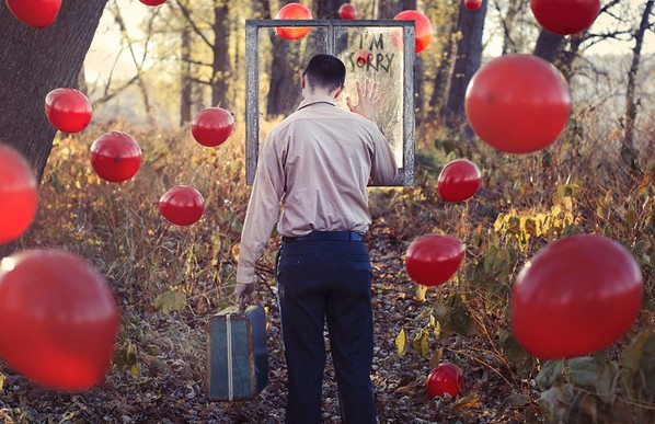
I don't like this photo because it’s not my type of photo that I find interesting to look at, that would be because I don't understand why there is balloons floating around in the air. But I do understand why they have but a window with I am sorry, maybe he has upset someone and he is trying to say sorry but they aren’t forgiving him so he is moving away from what he has done. He could of improved this photo by setting more of a dark setting because it doesn't go with the type of theme nightmare, so this photo has a light type of lighting the depth of field is about F10 and I know this because the background is out of focus, the shapes I can see in this photo is squares and ovals.
Anja Stiegler...
Most of her images are a mixture of surrealism and conceptualism and takes us into a fascinating world of daydream. Anja loves to awake feelings of freedom and happiness by using a wonderful combination of art and colours. She mainly gets her inspiration from music and everyday life.


I don't like...

I don't like this because I don't understand the photos story and what he is trying to tell us, even though it is my kind of style that I am going to do just don't understand how the photo is meant to link to weird and wonderful. In this photo I can see that this photographer has used a full shot so we can get a clear understanding of what we are meant to be looking at in the photo, the colours in this photo seems to be quite dark faded greys. I don't think this was took outside or inside because this looks like a type of photo that has been photo shopped to make it look more realistic, most of the shapes that I can see in this photo are circles and ovals. But if I was to create a photo of my own I would maybe do a person standing under the clouds and then do another type of object raining out of the cloud and so she can be swimming inside the object that I choose.
I do like!
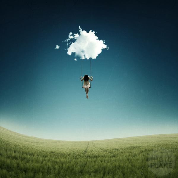
I do like this because it is setting like a daydream type of photo even though that I am focusing on nightmare I could do a photo with half nightmare and daydream, to get my photos to a higher grade in my work and hopefully it will make it more interesting to look at. The lighting in the photo a bright and happy type of mood setting and the colours are green, blue and white. The shutter speed is about F20 I know this because of the background of the photo it is out of focus, this because the photographer only wants you to concentrate on one thing and that is the little girl and the cloud. I can see that there is one shape in this photo and it is the wave on the grass area and also on the grass I can see that there is lines from like cars or something. Again this photographer has photo shopped it to make it realistic and there is a chance that this photographer has took it one place and then photo shopped it.
Rene Magritte.

Rene Magritte is a surrealism artist and this is one of his photos that he has painted, to support himself he spent many years working as commercial artist.
In this image I can see she has used the same type of colours in his painting, so he has used dark and light blues, greys and browns. In my opinion he could of used much more better colours to make it a much more better piece of work an so it stand out, but in his other photos he has used the same range of colours in the work.
The background of the photo is dark and it get light going towards the top of the photo and I know it represents the sky. In my opinion I do think it does has quite a dull background and the reason why he has used that type of background is because he want it to act like it is a bird flying in the sky but I don't know why he has put it on a person’s face....
The main focus in this photo would be the bird flying in the air so the bird would possibly be located on the hot spot and also the rule of third has been used on this photo, In my opinion I don't understand why the main focus is on the bird because I don't find it that interesting to look at, I don't know what he is trying to make the photo look like because I just think it is stupid.
This photo make me feel like it is pointless photo to look at and I feel like there is not story to and I always think there should be story in a photo, I just feel like all of his photos are pointless and there is no point drawing this type of thing. I do not like his work because I don't understand the concept of his work. Because most of his photos is putting something in front of a person’s face.
Salvador Dali.
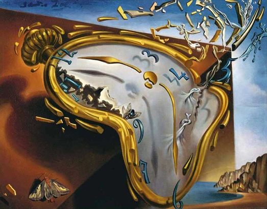
In this image I can see that there is a clock and he is trying to say that time is melting quick everyday so he is saying our time is worth every minuet and he wants to make it something that will catch peoples eye and make you look twice and wonder why he is going that and what he is trying to show and make us think about what is happening.
It is weird and wonderful because he has thought outside the box with his projects and from it I can see he has tried to make it into an illusion by doing this it gives me an idea to do something similar maybe with a face and when you turn it upside down it is happy but when it the other way around it is sad. In my opinion his work isn't the sort of work that would catch my eye because it isn't my type of thing I am going to do but at least I have ideas for my work because if I know that I would look at his work for inspiration but people like Christopher Mckenny work stands out to me, because its all about ghosts and making thing more creepy and eye catching. In this picture I can see loads of shapes that are in this picture but the shapes that mostly capture my eye is the shapes that are floating up to the sky.
MY IDEA...


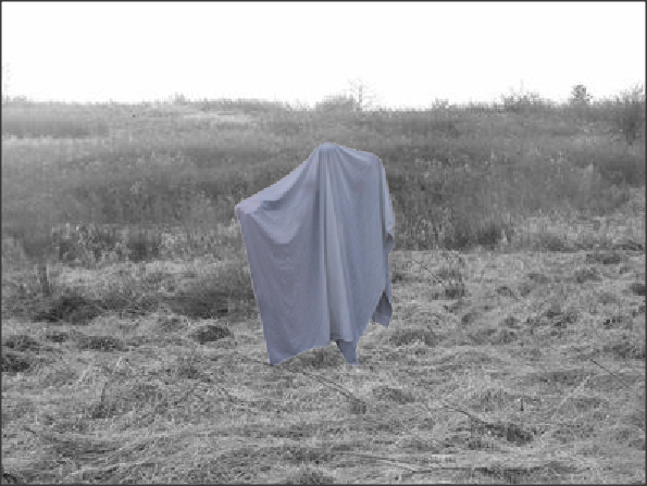
My Final Piece.
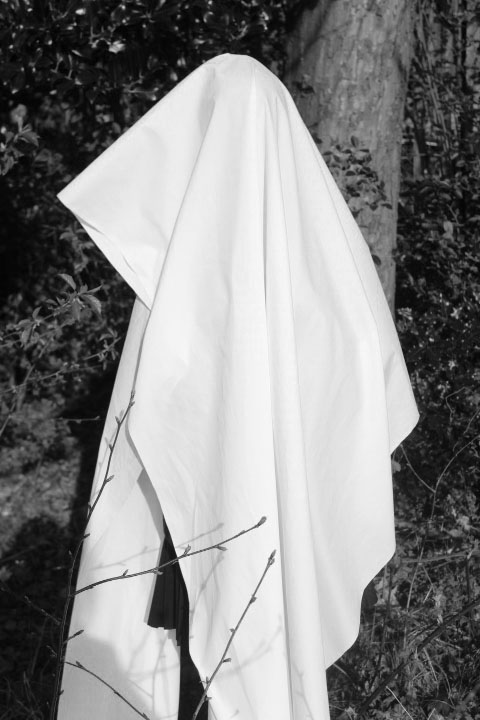
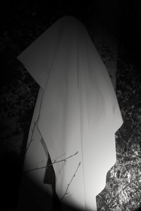
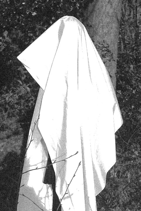
This is my final piece I am going make it more better by having more interesting things in my photos. Down below are photos that I took as you can see they have changed.
I am going to be making it look like the photo above but more detailed and it would also have more thing going on to make it more weird.


progress...


My final edit.
I like this more because I haven't fussed about on Photoshop with this photo, and it looks more realistic and doesn't look pix-elated so decided to retake this photo so that it looks nicer but I am going to be creating more different designs so it will be more creative.
Edited versions.
|
I like this more than my first Photoshop because I have used a lighting effect to make it more creative, also so I can mess around and see what I do and don't like about my photo that I have edited.
|
|
This is my second edit of my photo, I really like this photo because it is like an old photo camera and I feel like it is like an old horror film and that why I like it because it is different and it is something I am aiming to do.
|
My new plan.
|
.This is something that I want my last photo to be on...
|
What I want the picture to show...
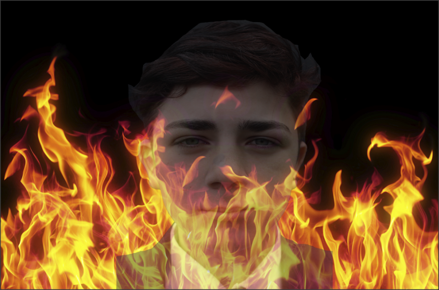
I want my picture to show someone fading away into the picture or just fading away, the main part that I want the people looking at my picture to notice first is the face fading into the fire.


Progress...


My final picture.

I like this because it stands out in my work, when I first see this picture the first thing that catches my eye is the eyes because they are a different colour to all of the picture and they are quite bright, and I just like how well it has faded it into the fire background.
I could improve the way I made him look scarier by doing a scar going down his face and then adding white face paint, or it would be better to do it outside of school so I get a better looking for my work. But I might go Photoshop and change the back ground so it stands out more and make change Callums face to be black and white or just a different fonts to make my face stand out a bit more.
My final plan.
|
My final plan will look something like this, but I think I am going to be changing the flower crown and putting something else on the head like a crown, horns or a halo to change it up a bit. I also might change up the make up so I am not fully copying.
|
I like this because it makes you focus on her full face, but mostly the blood dropping from her face and it is setting a Gothic theme and a nightmare type of photo. I like how he has made the person look straight at the camera to make you think that he is staring and it makes you feel uncomfortable.
I am really interested in this type of stuff because it is something I am interested in, it is also going to be my main type of work. In this photo I can see that this photographer has used dark lighting and colours to make the model stand out e.g. purples blacks white and reds. I can also see that the photo is a close up of the face and the eye level is making us look straight into our eyes so it stands out to us and make it look scary for anyone to look at, I understand why the photographer has made the model a white colour it is so she stands out from the background he has also made sure that she doesn't look too much like the background so in my opinion he has thought outside the box.


My favorties.
|
|
I like these because I have used different background so that my work is more productive and creative, my favourite out them all must be the 1st one because even though the light may be over exposed I can use Photoshop to change my work and make it dark. |


progress...


|
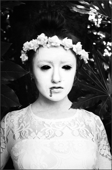
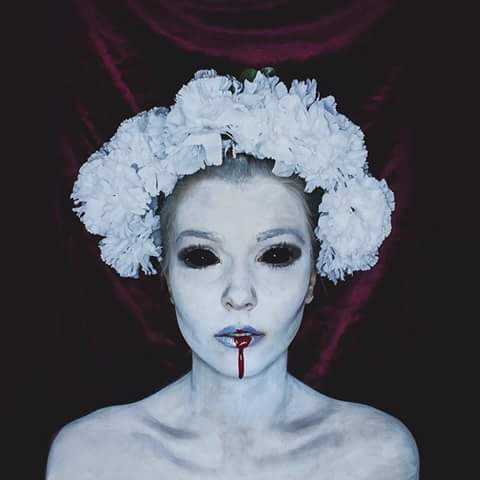
I like this because I have made sure that the blood is the main thing that is standing out, but then again I like how I have kept the shine on the eye because it gives it a spooky effect. It also creates more tension to the picture, I could have made her look spookier by fading the image to look more aged. Overall I think that I have accomplished my theme that I have done, also I have linked it to my research and my plan. |
|
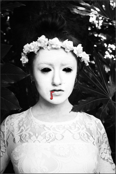
I really like this because I have changed up the way the eyes are so like they are being sucked into her head, also I like how I have made the background grainy. Also like how I have changed the background to create more of a spooky theme which I am aiming for. I feel like I could of made the flowers stand out more by adding more colour to it. |
|
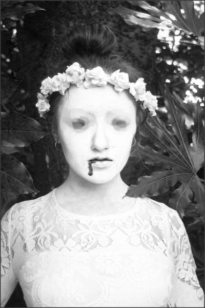
I like this because I have made all of the photo black and white and I wanted to see what effect it would give if the blood had no colour and it has gave it a different effect to my work and have made my editing a bit more different. And by having new idea for my editing skills I feel like it will bring my grade up. But then again I don't like it because to me there is nothing standing in the picture so therefore this is my least favourite out of the three.
|
Evaluation...
The year 10 project is about weird and wonderful and we got chosen to pick a theme 'Gothic' and the time that I got to do this project I really enjoyed it and I feel like my project has expanded and gotten better. I have enjoyed some of my Photoshop mostly on my last shoot because it was quite easy to do and also I like my different skills to make my work better. I also like taking pictures because I find it fun messing with props and make-up.
The techniques I have used is Photoshop and even though it has caused me some struggle but I have been able to overcome it and get my work done and do it to the best of my ability, But I would still want to develop my work on Photoshop more better so I could add more things into my work and make it more interesting to look at.
I have researched a couple of photographers I have looked at Erik Johansson, Christopher Mckennney, Anja Stiegler, Rene Magritte and Salvador Dali.
These photographers have influenced me because I like how their photos are different to the other photographers and I also like how they have been using Photoshop and investigating more into their work and that make me get some inspiration in to my work.
I have enjoyed taking pictures and experimenting with different props I could use and also make up wise for my last shoot, and also thinking about what backgrounds would work best. The most successful part of my project was my last shoot because I feel like I have really change my whole website and the way I thought about what I was doing in my last shoot. Some problems I have had was that I didn't have my props I needed for my shoot which made it hard for me to take pictures when I need to take picture but luckily I took time out of school to take pictures.
MY FINAL PICTURES.